Design: Colgate
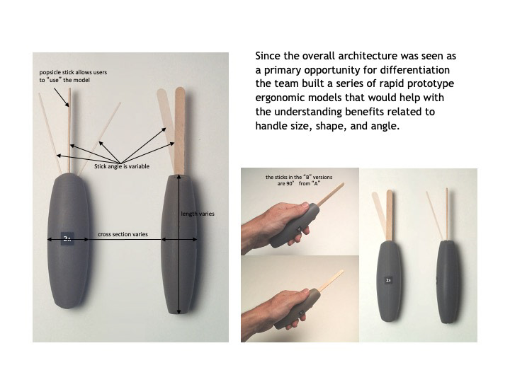
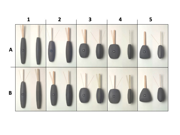
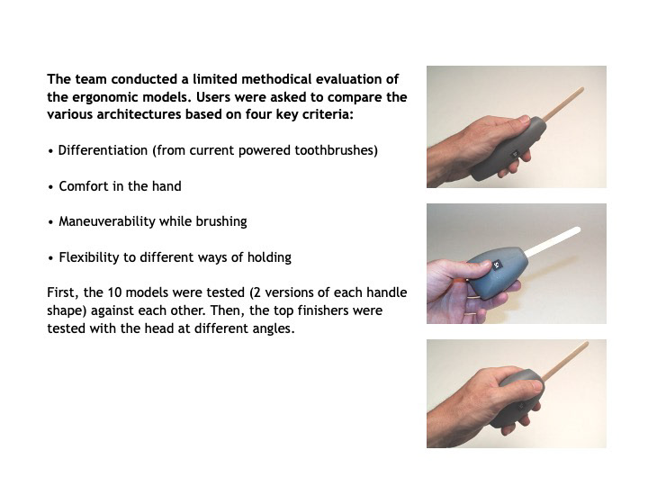
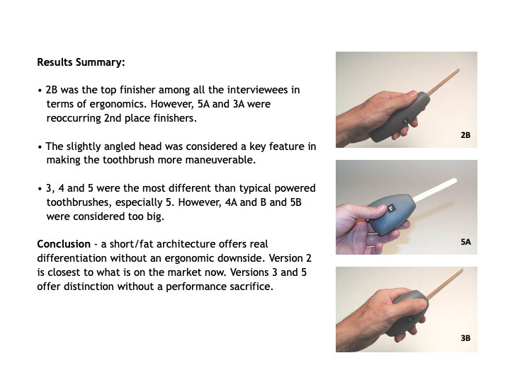
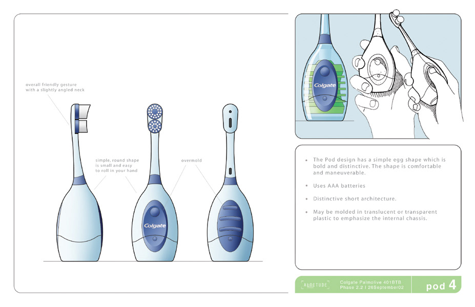
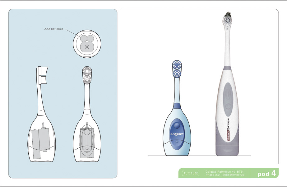
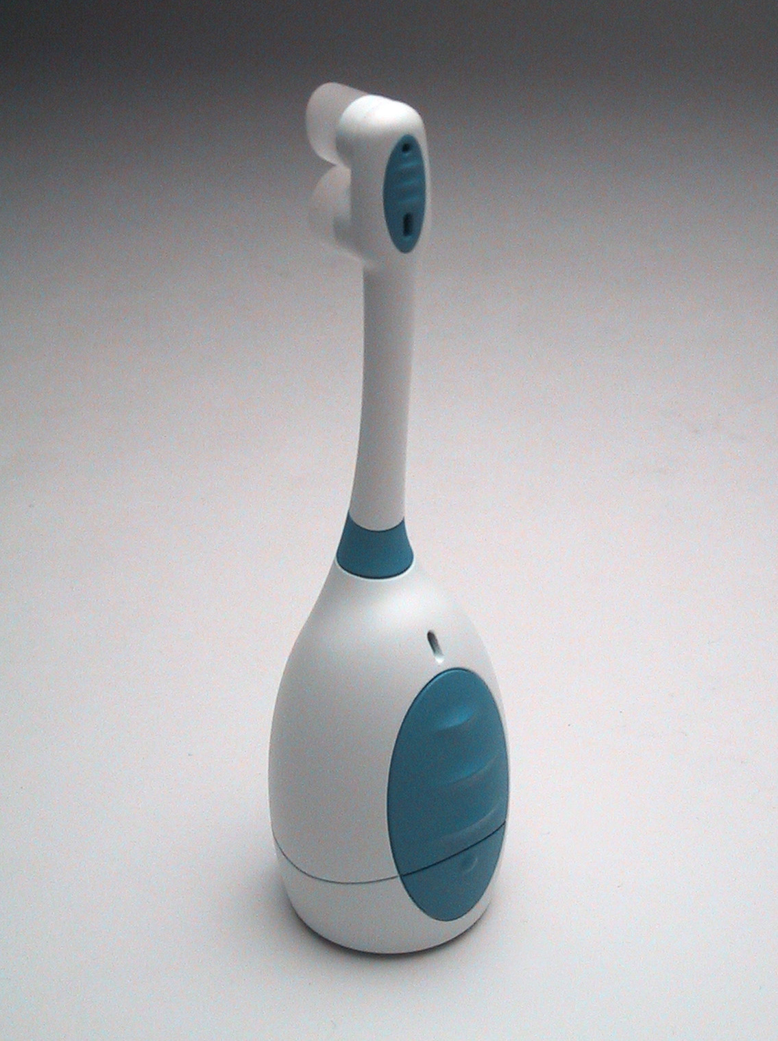
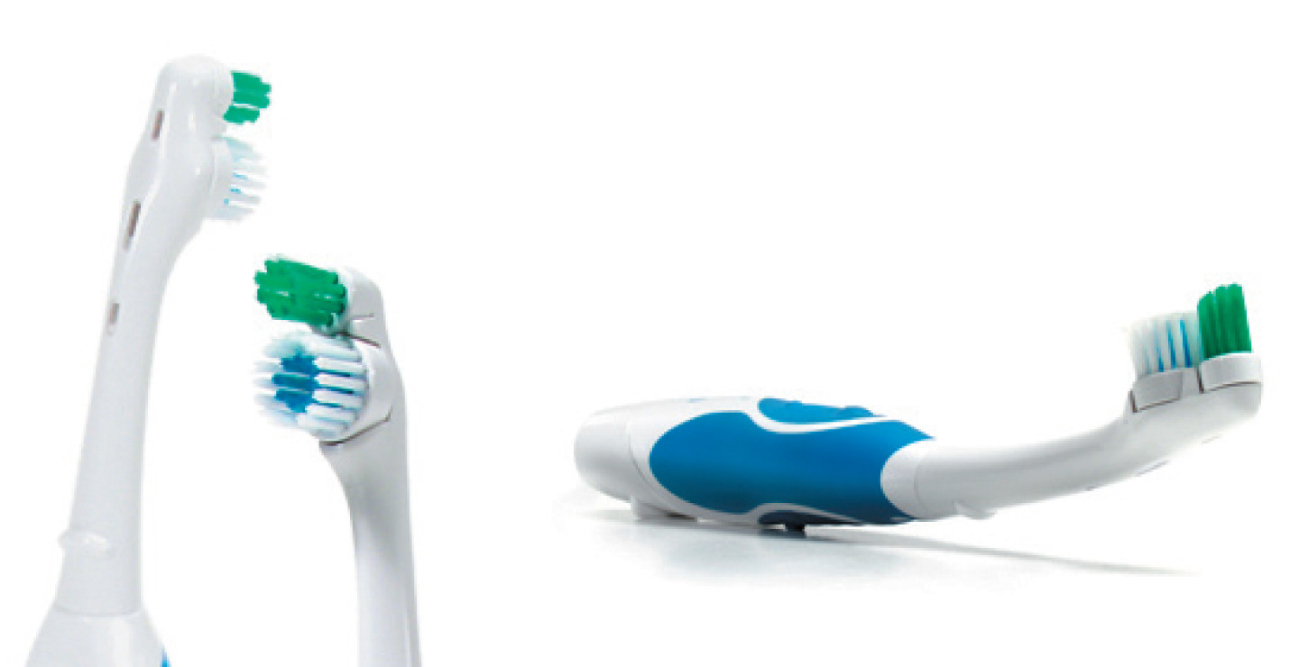
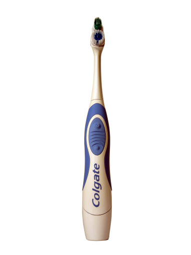
'Make it different' was the client directive. The market was crowded with nearly identical battery-powered toothbrushes and Colgate felt like it was time for a change. With this charge the design team began to focused on two activities - characterizing 'similar' and understanding & exploring ergonomics. The team determined that nearly all powered toothbrushes had an identical product architecture (3:2 handle:neck proportion), the same form type (highly organic) and the same color strategy (white with color accents). Ergonomic testing highlight opportunities to deviate from current architecture and forms. After broad exploration, three designs were presented; Pod (a completely new architecture), Twist (a new form vocabulary) and Lucent (a new approach to color & materials). Pod repackaged internal components to create a shorter egg-like handle. This design was visually distinctive, ergonomically effective, stable when set on a counter and present opportunities to simplify production and minimize material use. It also happen to bring a smile to the face of anyone who interacted with it. Twist maintained traditional product architecture but emphasized a logical and controlled form vocabulary. This design was different, but familiar, while evoking the efficacy of a professional dental instrument. Finally, Lucent involved designing the motor/battery frame and packaging it in a clear housing. This approach maintained a familiar architecture and form, while creating a very unique (at the time) look. The client eventually decided to focus on the Lucent approach, but the final designs are influences by all three concepts. The final direction had a replaceable neck, allowing ongoing use of the handle assembly after the bristles degraded.